 These are the majority of shots that I have edited to see what I can improve for the future shoots. Aspects of the sequence I will be checking include: Lighting, Mise en Scene, Lip syncing, pacing along with a variety of visual effects. Firstly the lighting was meant to present film noir, this is because I wanted to see if I could create the contrast between black and white. I believe that I had achieved the film noir style but there are still improvements that have to be made. For example at 00:07 the two characters are not lit at all, we only had a reflector but it didn't do a lot because of the weather. This lead to the shot looking very bland and flat because they aren't being lit separately to the wall. I feel that in future shoots I will try and light my subject using a standard three point lighting setup but use a strong key light and a strong hairlight to create the harsh shadows. To further improve this shot I will use better aspect ratio's in order to provide a modern wide screen look, without the gaps to the right.
 The next shot at 00:19 is a shot that I like because it really gives the sense of filmnoir because of the lack of light in it, which illuminates the Dan Bull logo. However I would like to take a shot like this and apply the three point lighting setup in order to distinguish the rapper from the background instead of him just blending in. This is because I want to add depth to this shot and because it will increase the contrasting lines that I am trying to achieve. I am looking into using a further two lights to illuminate the face more but light create a low key light look. Lastly I am going to be adding a little camera movement in post that will add to the overall aggressive vibe of the music video.
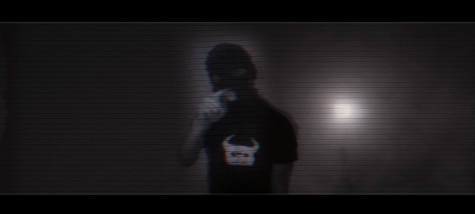 This shot at 00:26 is probably a shot that I will not be using in the actual product because it doesn't show enough of the performer. However I wanted to point out that the use of the light adds depth, which is distorted by the VFX and this is why I am either getting rid of the VFX on the shot or the shot its self. The reason the VFX don't work well is that they are not intergrated with the scene but instead put on top. Furthermore this shot isn't lit properly because we wanted one light behind the performer to see if the 'hairlight' would create a strong outline. Instead what we found was that we need a stronger 'hairlight' and 'keylight' in order to create the harsh shadows. In future shoots I while bring more lights to the scene.
 For the shots of Fraser's character at the begining of the music video I really wanted to push the idea of film noir in this music video. Furthermore I wanted to add depth using the camera to focus harshly on Fraser's face and then upping the blur in post. I only brought one light with me but I was fairly pleased with how this test shot has panned out. However for the actual shot I will be in a different location at a different time to avoid people walking in the background. This is because it can distract the audience from the character's emotion. I may further try and improve the shadows on his face by having a stronger key light.
This shot is another VFX shot that I wanted to try. It takes place at 00:?? and worked really well in terms of the visual effect, I thought that it would be a lot harder to pull off but by keeping it simple and not moving the camera it worked really well. However I want every shot to be perfect so I do have some aspects that I would change and some further things that people pointed out to me when I asked them for their critical opinion. I personally would change the framing of the shot, which was a view further expressed by others. This is because the shot doesn't focus on the flashback as much as I thought, which means that by the time the audience realise whats going on the action has already disappeared. Another mistake that was shown to me was that the light I used was reflecting in the window of the door, which overall distracted the audience from the narrative. On the topic of lighting I would light the scene better in terms of lighting the outline of both 'Fraser's' to provide an outline to them, separating them from the background further creating depth.
No comments:
Post a Comment