Wednesday 20 January 2016

Chiaroscuro - Film Noir - [Lighting Tests]


To see how I could improve the shots for the re-shoot I just used photos in order to experiment with lighting ideas, this is because I wanted to see how many lights I would need in order to create the low key light. This was further a test to see if my camera settings would need to be altered but they held up fine and I am now confident going into the re-shoot.

In order to create this Film Noir look I only used a single key light that I got my camera man to adjust, I ended up liking the light being underneath the subject more than above because it outlined the features of the face while maintaining the depth in the background.So that it would further help me I did a similar position to Fraser so that I can refer back to this image to see what I am going for.


In photoshop I tried to keep the adjustments minimal because I wanted to focus on the lighting more than post production because I see the editing stage more as an extension of what I do on set. This meant that I only converted it to black and white and adjust the brightness and contrast. All these same affect can be achieved in a video editor so it is easy to apply the same ideas.

Colour - [Correction Grading]


The colours in my music videos are highly important because it really helps set the tone and style of my work. Even though I am using black and white to create harsh chiaroscuro shadows I think that the colour grading is still important because by adjusting them they change the tones of the blacks and whites. This means that I will actually colour grade before I put the black and white in because I want to make sure that the colours not being there don't take away from the experience but instead add to it. Within colour correction I would firstly adjust the colours at opposite ends of the colours spectrum, mainly focussing on the blues and reds. This is because i know from my knowledge of working on the film opening last year that these colours are the main two to make something cinematic. I would then further adjust contrast, tones and brightness to add depth and draw out certain colours or tones. This would give me my base of colours to focus on, I would then look at adding a grade over the colours which help add depth and stylise the films look and tone. I would either use the tools given in Premiere or After Effects.

Sunday 10 January 2016

Digipak - Artist Feedback


While creating the digipak I have stayed in contact with the artist and his fanbase through the platform of twitter. This has allowed me to get feedback and improvements throughout the process because the users on the sight always prove to be very, very opinionated. Furthermore the artist himself pointed out a few improvements!


Saturday 9 January 2016

Teacher/Peer - Feedback


After finishing my digipak I decided to get a focus group together in order to get feedback from my peers and teacher. I handed out a strengths and improvements sheet and these were the responses:

Strengths:

  • Love the close ups of the eyes, very intense.
  • I like the ski mask. 
  • The cover links to the narrative.
  • The colours link to the video.
  • Fits the type of video.
  • Good editing.
  • Cover looks good, colours and typography.
  • The logo's design.
  • Professional.
  • Text, colours and composition.
Improvements:
  • Brighten the image.
  • Too dark.
  • Vignette. 
  • Writing is too dark.
  • Too much grey


Thursday 7 January 2016

Album Cover - [DigiPak] - First Draft - Audience Analyses


For my first draft of the music video album cover I wanted to capture the emotion that the character would feel while singing the song. To further develop this emotion I wanted the album cover to have a series of close ups in order for the audience to be gripped with emotion. This will act as a platform to build upon when they listen to the track and watch the video, this will overall help them connect with the character. In terms of style I knew that I wanted the only colour in the music video to be the blue so I thought that I would look into a technique called 'Colour Splash', which allows me in photoshop to single out certain colours and make the rest black and white. The reason for this is that I wanted to focus on the low key lighting and dramatic film noir shadow look while maintaining the internet modern look you see across the web and television.


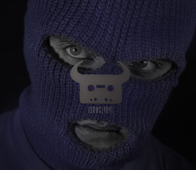
I believe that I have achieved what I set out to do with this album cover because all the colours have worked really well together and have developed form the drawings I created. However I do believe that I could of made some more improvements and adjustments to this before I use it as the final digipak. Firstly I want to clean up some of the colours because there are some areas in which the blue hasn't worked very well so that means that there are patched of grey. I found this out when I posted the first draft online for feedback, I posted it online because I wanted to get feedback from both the arist and his fans because they are the target audience for this digipak. The feedback I got of the overall design was positive however some mistakes were pointed out like the grey patched particularly around the eyes and mouth. In addition to this I had spelt his slogan wrong, "Douglyby"


which is meant to say "Douglby".


If I had released this to the public before making these checks I would have caused upset to the Dan Bull community and probably done his work more harm than good. This overall shows the importance of audience feedback. Further improvements that I want to be made is something that was picked up on within a second viewing of the digipak the next day. When I looked at the second image the logo has the distinct characteristic of a nose, this is a design floor because it ruins the overall tone of the album. To counter this I want to adjust the design or change the image that it

there. Overall I am pleased with this digipak but I will be taking more images that can be used as the poster or to replace the image with 'the nose'.