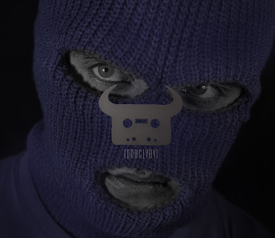
For my first draft of the music video album cover I wanted to capture the emotion that the character would feel while singing the song. To further develop this emotion I wanted the album cover to have a series of close ups in order for the audience to be gripped with emotion. This will act as a platform to build upon when they listen to the track and watch the video, this will overall help them connect with the character. In terms of style I knew that I wanted the only colour in the music video to be the blue so I thought that I would look into a technique called 'Colour Splash', which allows me in photoshop to single out certain colours and make the rest black and white. The reason for this is that I wanted to focus on the low key lighting and dramatic film noir shadow look while maintaining the internet modern look you see across the web and television.
I believe that I have achieved what I set out to do with this album cover because all the colours have worked really well together and have developed form the drawings I created. However I do believe that I could of made some more improvements and adjustments to this before I use it as the final digipak. Firstly I want to clean up some of the colours because there are some areas in which the blue hasn't worked very well so that means that there are patched of grey. I found this out when I posted the first draft online for feedback, I posted it online because I wanted to get feedback from both the arist and his fans because they are the target audience for this digipak. The feedback I got of the overall design was positive however some mistakes were pointed out like the grey patched particularly around the eyes and mouth. In addition to this I had spelt his slogan wrong, "Douglyby"
which is meant to say "Douglby".
If I had released this to the public before making these checks I would have caused upset to the Dan Bull community and probably done his work more harm than good. This overall shows the importance of audience feedback. Further improvements that I want to be made is something that was picked up on within a second viewing of the digipak the next day. When I looked at the second image the logo has the distinct characteristic of a nose, this is a design floor because it ruins the overall tone of the album. To counter this I want to adjust the design or change the image that it
there. Overall I am pleased with this digipak but I will be taking more images that can be used as the poster or to replace the image with 'the nose'.


No comments:
Post a Comment